August 25, 2022

In this blog post, Cultural Infusion’s DEI Director, Roman Ruzbacky, discusses eight exercises used to analyze data related to diversity in the workplace.
Overview
Over the last six months, I have posted a series of simple diversity and inclusion exercises that look at the critical interpretation of diversity data and some traps people may have fallen into, including myself. Starting my career as an analytical chemist, I have always been interested in diversity data, and not forgetting human behind the figures.
It’s easy to struggle analysing diversity data and understanding what the data is saying. At times we need to look at other influencing factors or work with missing data. How do we translate data or series of data sets into a succinct action? It can be complex process and tricky at times.
Integrity of the data and its interpretation is critical if we need to get to the truth of the matter or come up with appropriate solutions. Over the course, I have seen manipulation, fudging, cherry picking, poor presentation of data and just poor analysis.
Case Study One
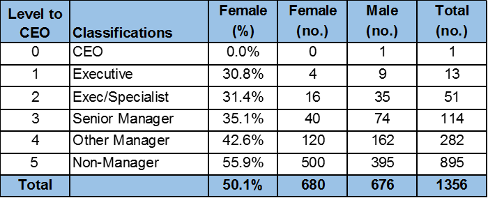
Each year the Workplace Gender Equality Agency publishes an annual Australian gender equality scorecard. The gender composition across classification roles is presented in the table below and has usually fallen this way for the last few years.
What more comes to mind? Under-representation of women in leadership? Under-utilisation of skills? Slower transition of women into leadership? Impacts of career breaks on career progression? Structural issues contributing to widening pay gap? The need for targets if this doesn’t change in a few years?
What else could you look at? Further breakdown of non-manager levels. Analysis of other diversity dimensions (age, cultural diversity, disability, TGDNB, etc)? Distribution of fixed term and casual work? Part time rates in upper levels? Recruitment and exit data? Job types?
Table 1. Representation of Women
Case study two
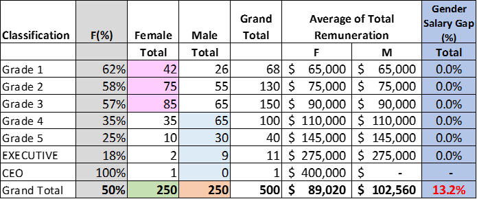
Years ago, when I heard that an organisation achieved a 0% pay equity gap between men and women, I got a bit curious. Actually, I was pretty sceptical. If you wanted to do some back of the envelope calculations, then transpose the data below in an excel spreadsheet and run through the calculations to see how the pay gap is also a structural issue. Public WGEA reports will show you how many men and women are in the organisation’s workforce and a breakdown of level from the CEO. You can find general remuneration data in Enterprise Agreements to work our roughly remuneration at each classification band. The example below shows an in band pay gap of 0% at each classification level and an overall gap of 13.2%
Table 2. Pay equity gap between men and women
Case Study Three
I went to a pay equity forum recently which was superb. They spoke about pay equity gaps for women, people with disability, cultural diversity, and even social economic background. I didn’t see any slides with calculations.
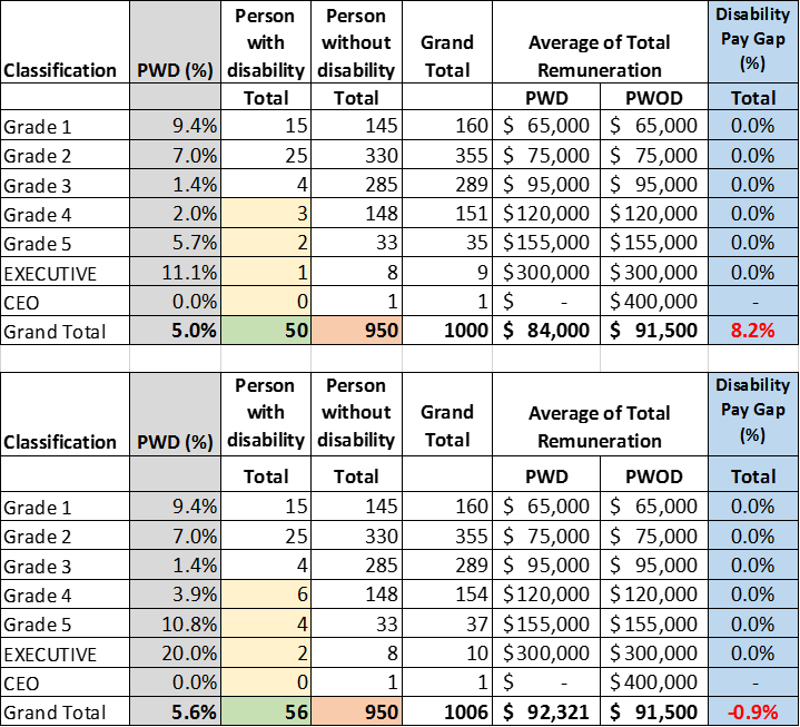
In our DEI work, we often see people with disability in organisations who are highly qualified and experienced working in lower grades (real pay inequity). More people with disability in leadership will also help to tackle the pay inequity, including structural pay gap. As we build confidence and comfort in people sharing information, we will also see more accurate internal data.
The first example shows what happens if we double the number of people with disability in each leadership classification levels (grade 4 to CEO) from 6 to 12 people in an organisation of ~1000. In this case, the gap goes from 8.2% to -0.9%.
Table 3. Pay equity gap between people with and without disability
Case Study Four
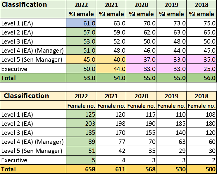
We often talk about our work in DEI work being a marathon, not a sprint. Some organisations who have been doing long term work in gender equity would understand the importance of longitudinal benchmark data.
Often when starting gender equity work in the organisation for the first time (even in 2022 – you’d be surprised) there may be a period of stagnation before things start to improve (years two and three). You can usually map out points of impact, where significant pieces of work have been introduced or completed year on year.
I always felt it was important to include percentages and numbers when presenting data, especially when the sample size is small (e.g., executive groups). We can also drill down into work area too. Presenting the data according to enterprise agreement classification levels tells us what may be happening at entry level and the top of non-management levels. These figures also show if an organisation is going through a period of growth or decline in staff numbers. Intersectional analysis will show you where people are populated in the organisation. For example, it’s easy to quote a broad figure of for example 10% people with disability and not show where they are located and where they move over time.
Table 4: Longitudinal gender representation data
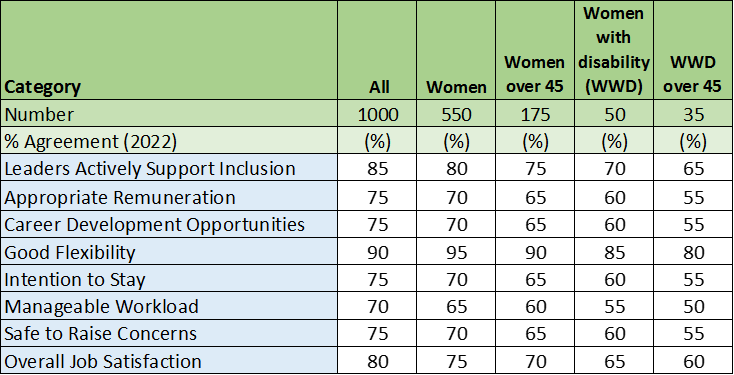
Case Study Five
I have designed and completed analysis of a number of anonymous diversity and inclusion surveys over the years. When slicing and dicing data, I often try to explore the experiences of people of diverse backgrounds in mainstream employment situations. I also try to explore the experiences of people with multiple dimensions of diversity. Why stop at just gender when we can conduct intersectional analysis and explore intersectional inequity better? Even with a lower sample size we can still see trends, and who may be more vulnerable, excluded or experience discrimination in the workplace. With increased comfort and confidence in sharing information we will get a better representative sample. This is only one example of how you may start to look at intersectional analysis. We can further explore which mainstream employment situations does one feel excluded?
We could also look at some greater personalisation of DEI actions, not broad-brush strokes, and a one size fits all strategy. Think about how to be inclusive in all settings. We should expect the employment experiences of all people in the workplace should be exemplar. They shouldn’t be poorer because of your personal attributes.
Table 5: Diversity and inclusion survey results
Case Study Six
There was a survey conducted in an organisation (comprising 1050 staff) on gender equity. There were 1000 responses to the anonymous question ” My immediate supervisor genuinely supports equality between women and men”. Responses were from 600 men, 395 women, and 5 non-binary. 96% of people were in agreement. The organisation thought that’s a fantastic result.
Unpacking further, I looked at the representation of women in the Executive Group, nine men and one woman. I conducted a pay equity analysis between men and women, and it was 20%. I looked for any action plans on gender equity, there were none. All the external web site marketing materials included men. What other information may be missing? Has the work environment been accepted and normalised? What do you now interpret from this?
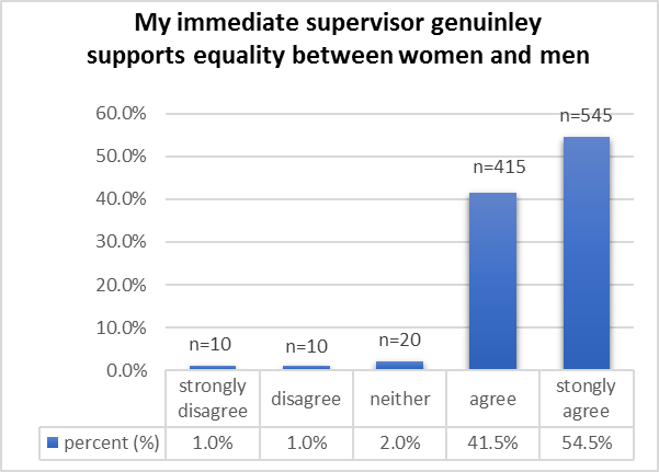
Figure 1. Survey result on supervisor supporting gender equity
Case Study Seven
Organisations often run annual insight or culture surveys. Diversity & Inclusion practitioners are keen to see how the organisation is tracking in their DEI efforts as well as the impact of the work. Are we getting through? Often, when asked to lead DEI work, and running consultations or conducting focus groups, I am asked what equity issues have being raised? What concerns me at times, is what is not being raised or talked about?
So, when looking at free text responses, I usually do a key word search on diversity, inclusion, gender, race etc, and frequency of responses to determine the level of awareness. Are people contemplating DEI work in their day-to-day decision making and interactions? What is their level of consciousness. Over time, and with sustained efforts in DEI work, I have seen the frequency and quality of DEI related comments in surveys improve over time.
Q. What is your organisation doing well?
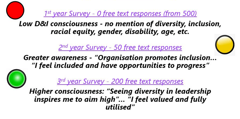
Figure 2. Frequency of free text responses to DEI surveys
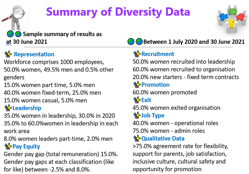
Case Study Eight
This post was inspired by someone who recently pointed out the need for transparency of pay equity data. Why, because it is connected to other parts of the work. We can often look for singular issues without connecting the dots and seeing how everything is connected. When we are missing critical bits of information, we are flying blind. For example, in this simple case study, look at the recruitment, promotion and exit patterns, vulnerability in employment, job segregation, pay equity, and employee experience, etc. Then when we write our action plans, we are keeping in mind that it is the combination of actions that help move the dial, not just singular actions.
Figure 3. Summary of diversity data in employment
I hope these are useful tips you can use in your work. I encourage you to be curious.
About the author:
Share this Post
If you'd like to get in touch and experience a one on one demo of Diversity Atlas.
Book a Demo